


6 Ways To Create an Excellent Thrift Store Customer Experience
How you display merchandise in your thrift store matters just as much as what’s on the shelves.
A well-organized, visually engaging store invites customers to linger and spend more, while a cluttered space sends them right back out the door.
In this blog, we’re diving deep into thrift store display ideas by category — including clothing, books, kitchenware, electronics, accessories, and furniture.
Let’s get into it.
Window & Entrance Display Ideas for Thrift Stores

Before a customer even steps inside, your window display is doing the selling. It’s your most valuable real estate, so don’t let it become a dumping ground for overflow inventory.
Here are some tips for thrift store window displays:
- Rotate your window display: Change out your display every two to four weeks. Regular customers notice, and it gives them a reason to come back in.
- Build your window around a theme: This could be a season, color palette, decade, or an upcoming holiday.
- Layer heights: Use risers, stacked books, or crates to create dimension.
- Use signage: Add a chalkboard to announce deals, events, or rotating stock.
On a budget? You don’t need to buy a single prop. A stack of vintage suitcases, a cluster of retro kitchenware, or a draped collection of colorful scarves can make a stunning window display using items you already have on the floor.
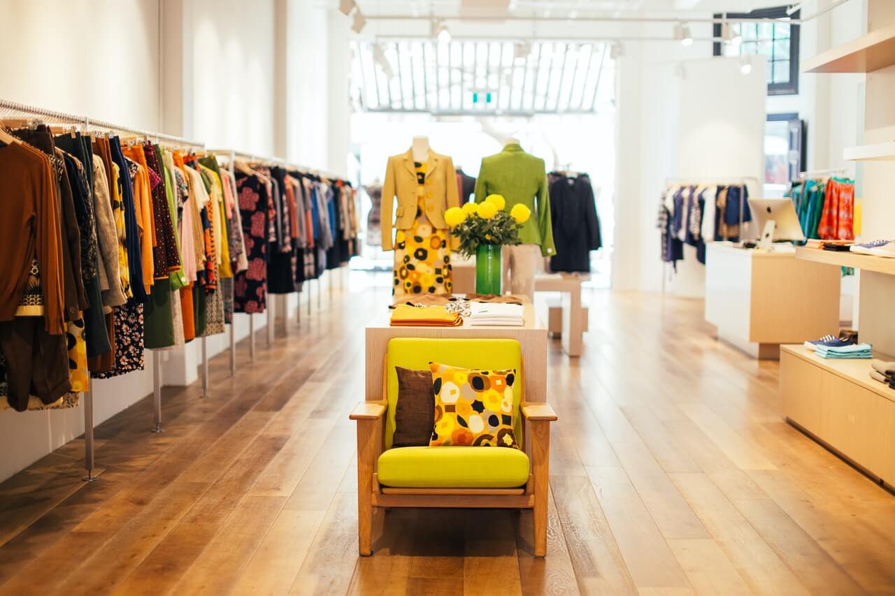
Clothing Display Ideas for Thrift Stores

Clothing is usually what brings people through the door. But racks packed with garments and no clear organization can have the opposite effect.
The solution is a combination of smart organization and intentional styling.
Here’s how you can do that:
- Organize by color: It sounds simple, but it works. Color-blocking your racks makes them visually appealing and far easier to shop. It’s one of the quickest wins you can make on the floor.
- Use mannequins to tell a style story: Put together a complete look — outfit, shoes, accessories — and let the mannequin do the selling. Customers who struggle to visualize how pieces work together will appreciate it, and a well-styled display can move multiple items at once. Swap looks regularly, so repeat shoppers always see something fresh.
- Feature a "staff picks" or "new arrivals" rack: A dedicated rack near the entrance for your best recent finds gives customers an immediate reason to stop and browse.
On a budget? Look for mannequins at closing retail stores, estate sales, or other resale shops. Half-bust forms and dress forms cost less than full mannequins and work just as well for tops, jackets, and accessories.
Related Read: 7 Thrift Store Layout Ideas To Try Today
Book & Media Display Ideas for Thrift Stores

Books, vinyl, DVDs, and video games are some of the most fun sections of any thrift store. But if your customer can’t find what they’re looking for, they’ll give up.
Here’s how to display books and media in a thrift store:
- Organize alphabetically and by genre: Fiction, mystery, self-help, cookbooks, children’s — whatever makes sense for your inventory. Add letter labels to shelves or crates so customers can navigate without asking for help.
- Face-out featured titles: Most books will live spine-out, and that’s fine. But mixing in a few face-out covers — especially for vintage hardcovers or anything visually striking — breaks up the monotony and catches the eye.
- Create a reading nook corner: Set up a cozy spot with a donated armchair, side table, and a curated stack of books nearby. This creates the kind of moment your customers will want to tell friends about.
On a budget? Hand-lettered chalkboard signs or printed labels in simple frames are all you need to section off genres. They look intentional, and they cost almost nothing.
Kitchenware & Dish Display Ideas for Thrift Stores

Kitchenware has more visual potential than almost any other section in the store. The problem is that most thrift stores don’t take advantage of it. Piling dishes into milk crates and calling it a day leaves a lot of sales on the table.
Here are some kitchenware display ideas:
- Group by color or style: Pull your blue and white pieces together. Do the same with copper cookware, jadeite, and ironstone. Items that look like forgettable clutter on their own become a cohesive, desirable collection when they’re grouped together.
- Mount plates and platters on the wall: Wall space is often completely wasted in kitchenware sections. A gallery-style arrangement of plates — alternating sizes, varied patterns — draws the eye up and makes the whole section feel more intentional.
- Stage a table setting: Use tablecloth, dishes, glassware, napkins, and a small centerpiece, all pulled from your current inventory. When customers can see how pieces live together in a real setting, they’re far more likely to buy the whole thing.
On a budget? A tension rod or wooden dowel mounted between two shelves creates an instant hanging display for mugs, utensils, or small baskets that costs virtually nothing.

Electronics Display Ideas for Thrift Stores

Electronics require a different approach than the rest of your store. Customers want them, but they’re hesitant because they have no way of knowing if something works.
Your display strategy needs to address that hesitation head-on. Here’s how:
- Test and label everything: Before any electronics hit the floor, plug them in. Then, add a simple tag that says, "Tested and working" with the date.
- Clean items before display: You can completely change the perceived value of an appliance or electronic with a thorough wipe down. Clean, polished items read as cared for and trustworthy. Grimy items, even if perfectly functional, get passed over.
- Use clear signage for specs and price: Include a small card or tag with key details: What is it? Does it work? What’s included (cords, remotes, accessories)?
- Lock up higher-value items: Cameras, gaming consoles, and vintage audio gear all deserve a locked display case or a spot behind the counter. It protects against theft and shows that they’re worth something.
Low on space? Mount a pegboard or narrow shelving unit on the wall to take smaller electronics vertical. It keeps your floor clear and makes the section much easier to browse.
Jewelry & Accessories Display Ideas for Thrift Stores

Jewelry and accessories are often high-margin, high-interest items, but they’re easy to lose in a disorganized bin.
Here’s how you can organize jewelry in a thrift store:
- Group by type: Separate necklaces, earrings, brooches, bracelets, watches, and rings into their own zones. Within each zone, organize by color or metal tone for easier browsing.
- Keep the affordable and the special separate: Place everyday costume jewelry in clearly priced bins or trays. Reserve a lockable case or dedicated display area for higher-value pieces so they get the attention they deserve.
On a budget? An old cheese grater or a piece of pegboard can become a wall-mounted jewelry display that looks like it was planned from the start.
Related Read: 6 Inventory Storage Solutions for Thrift Stores
Furniture & Home Decor Display Ideas for Thrift Stores

Furniture is hard to merchandise well. It’s bulky, hard to move, and easy to just park pieces wherever they fit. But the stores that take a more intentional approach sell more of it.
Here’s how to display home decor in a thrift store:
- Stage rooms: A sofa on its own is just a sofa. A sofa with a rug, throw pillows, a side table, a lamp, and something on the wall behind it is a living room someone can picture themselves in. The IKEA method works in secondhand retail just as well as it does in new retail — maybe better, because every piece has its own story.
- Use furniture as display infrastructure: A donated dresser becomes a display surface. A vintage hutch showcases your kitchenware. A bookcase organizes your media section. Think of your furniture inventory as both product and display fixture. You can sell it right off the floor.
- Rotate regularly: You don’t need to overhaul the entire floor. Moving one piece or refreshing the accessories in a vignette is enough to make a loyal customer stop and look again. Aim for at least a monthly refresh on your major displays.
Low on space? Don’t try to fit everything in. Leaving breathing room around your vignettes makes individual pieces feel more considered, and gives customers enough space to walk around and imagine a piece in their own home.
Run a Smarter Thrift Store With ThriftCart
Great displays bring customers in, but keeping your thrift store stocked, organized, and profitable takes the right tools behind the counter. That’s where ThriftCart comes in.
ThriftCart is an all-in-one point of sale (POS) system specifically for thrift stores, so you don’t have to force a generic POS system to do something it wasn’t designed for.
With ThriftCart, you can:
- Track donations and print tax receipts on the spot.
- Sync online inventory, sales, and reporting in one place.
- Manage color tags and pricing rotations without spreadsheets.
- Speed up checkout and reduce training time for volunteers and staff.
If you’re putting in the work to make your store look great, you deserve thrift store POS software that keeps up. Schedule a demo today and see ThriftCart in action.


With three years in the thrift industry during a pivotal shift to omnichannel selling, Kyle Payton helps stores better manage inventory and forecast product needs. As General Manager at ThriftCart, he focuses on equipping nonprofit thrift operations with point of sale technology that makes their day-to-day operations easier.
Kyle's passion lies in helping thrift store managers embrace digital solutions that support their unique mission and maximize their impact in the community.
"Supporting nonprofits is incredibly rewarding. I’m here to provide thrift store managers with the tools they need to thrive, so they can continue making a positive difference in their communities."